Grid Systems in Graphic Design
The invisible backbone of great layouts.


TL;DR
This guide explains grid systems in graphic design, the invisible structures that make layouts balanced, readable, and professional.
- Manuscript grids use a single large column, ideal for text-heavy content like books and essays.
- Modular grids combine columns and rows, common in dashboards, calendars, and portfolio websites.
- Baseline grids space horizontal lines at regular intervals to keep text vertically aligned across pages.
- Radial grids extend outward from a central point, suiting logos and rotational designs.
- Design tools like Canva build grid structures into templates so users can focus on content.
How structure makes a design work
Every polished poster, magazine spread, or website you've ever admired was built on something you probably never noticed: a grid. Grids are the quiet architecture behind good design. They are invisible to the viewer, but indispensable to the designer. They're the reason a layout feels balanced and the reason your eye knows exactly where to go first. This blog breaks down what grid systems are, the main types you'll often encounter, and why they remain one of the most fundamental tools in a designer's kit.
What is a Grid System?
A grid system is a structure made up of intersecting vertical and horizontal lines that divide a page or screen into columns, rows, and modules. It's a tool for placement, which tells a designer where a headline should sit, how wide a text block should run, or how much space should separate one image from the next. It works just like scaffolding: it doesn't appear in the finished piece, but without it, everything built on top would be uneven and unstable.
The main types of Grid Systems
Different projects call for different grid structures. Here are the most common ones designers reach for.
Manuscript grids are the simplest form, essentially a single large column, often used for text-heavy content like books, essays, or long-form articles. They prioritize readability over visual complexity.

Column grids divide a page into vertical columns of equal or varying widths, giving designers flexibility to organize content into distinct blocks. These are common in magazines, newspapers, and websites where multiple stories or sections need to coexist on one page.

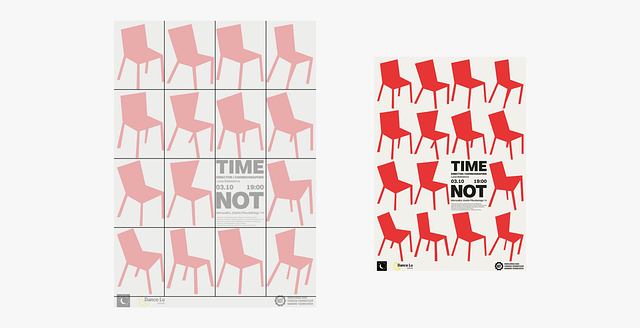
Modular grids combine columns with rows to create a grid of individual modules or cells. This is the system behind most complex layouts, such as data-heavy dashboards, calendars, or portfolio websites, where content needs to be organized into consistent, repeatable units.
Baseline grids are horizontal lines spaced at regular intervals that govern where lines of text sit, ensuring consistent vertical rhythm across a document. They're especially important in typography-heavy design, keeping text aligned across columns and pages.

Hierarchical grids are more organic and are built around the natural flow of content rather than a strict mathematical structure. They're often used for websites where content blocks vary in size and importance.

Radial grids extend from a central point outward, with lines radiating like spokes on a wheel rather than running parallel. This structure suits circular or rotational designs, such as logos, infographics, or layouts built around a focal image, where content needs to feel like it's emanating from or orbiting a single center.

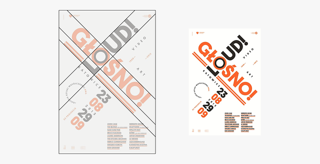
Axial grids are organized around a single axis, either horizontal or vertical, that runs through the layout and acts as the central line of alignment. Elements are arranged symmetrically or in relation to that axis, creating a strong sense of direction and focus. This structure works well for posters, invitations, or any design meant to draw the eye along one clear visual path.
Why Grid Systems matter
Grids do far more than keep things tidy. They create visual consistency, which helps build trust and professionalism. A brand that uses the same grid structure across its website, social posts, and print materials feels cohesive and deliberate, even if the audience can't articulate why.
Grids also establish hierarchy. By defining where elements sit relative to one another, designers can guide the viewer's eye toward what matters most, whether that's a headline, a call-to-action button, or a hero image.
There's also a practical, collaborative benefit. When teams work from a shared grid system, it becomes far easier to scale a design across multiple pages, platforms, or team members without everything drifting out of alignment. This is one reason grids are baked into the templates found in tools like Canva, which handles the underlying structure so users can focus on customizing content.
Finally, grids speed up the design process. Instead of making structural decisions from scratch every time, a good grid system becomes a reusable foundation that designers can return to project after project.
Conclusion
Grid systems are one of the most important parts of graphic design. They provide the order that makes creativity legible, transforming a collection of text and images into something a viewer can actually navigate and understand. It makes a design feel intentional. Once you start seeing the grid behind great design, you can't unsee it, and that's what will help you be a great designer!